📌 justify-items
: grid 셀 안의 내용물을 가로 방향으로 정렬
- 부모 요소에 적용
- width가 지정되었다면 내용물을 가로로 이동시킴
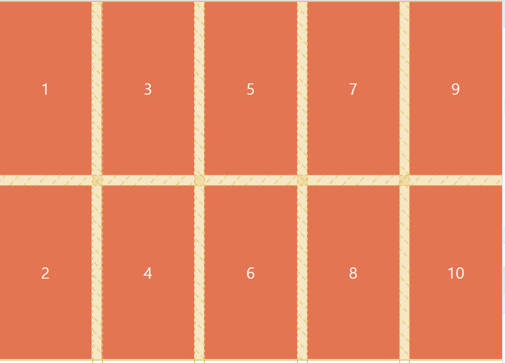
- stretch
: 내용물을 가로 방향으로 늘림
- 기본값
- 자식 요소에 너비(width)가 없을 때만 적용⭕

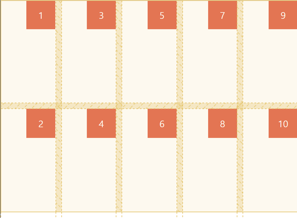
- start: 주축의 시작 부분(왼쪽)으로 정렬
- end: 주축의 끝 부분(오른쪽)으로 정렬
📌 align-items
: grid 셀 안의 내용물을 세로 방향으로 정렬
- 부모 요소에 적용
- stretch
: 내용물을 세로 방향으로 늘림
- 기본값
- 자식 요소에 높이(height)가 없을 때만 적용 ⭕
- start: 주축의 시작 부분(위쪽)으로 정렬
- end: 주축의 끝 부분(아래쪽)으로 정렬
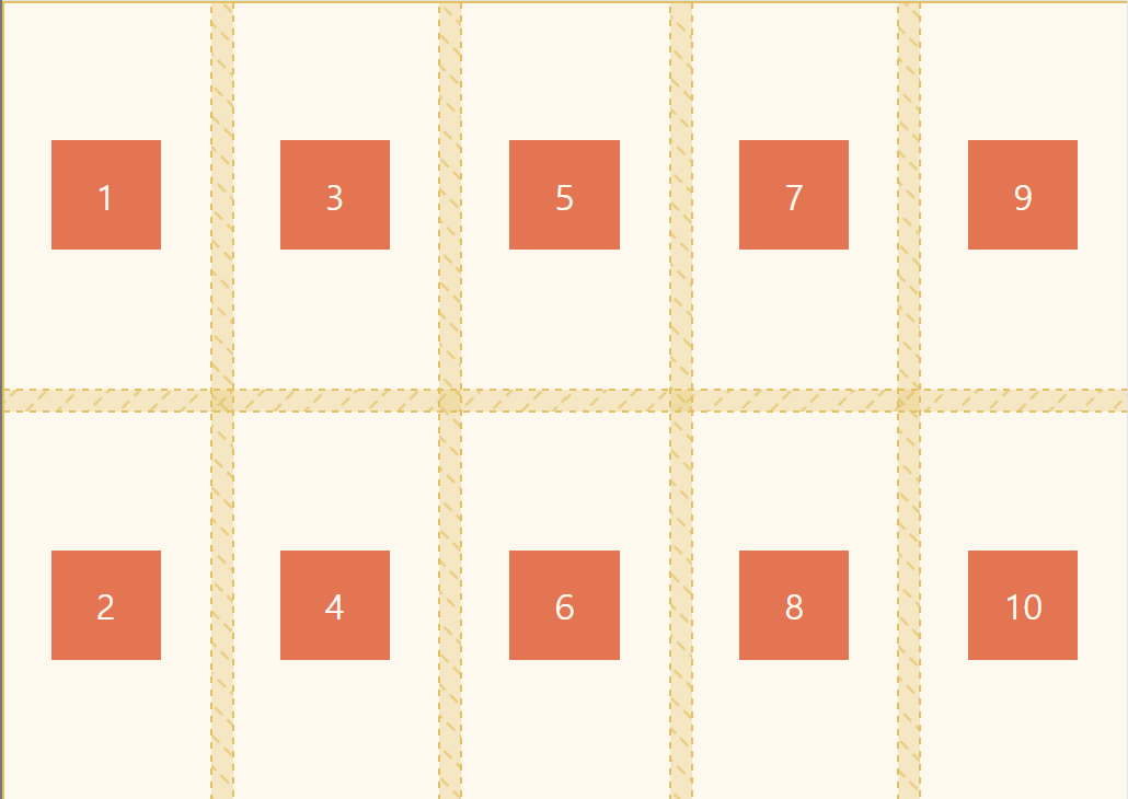
- center: 가운데 정렬

- justify-items: stretch;
align-items: stretch;
- width, height ❌

- 내용물 중앙 정렬하기
.father {
    display: grid;

    justify-items: center;
    align-items: center;
}

.child {
    width: 50px;
    height: 50px;
}
📌 place-items: align-items(세로) justify-items(가로);
- 단축 속성: align-items + justify-items
📌 justify-self
: 한 개의 박스 내용물을 가로 방향으로 정렬
📌 align-self
: 한 개의 박스 내용물을 세로 방향으로 정렬
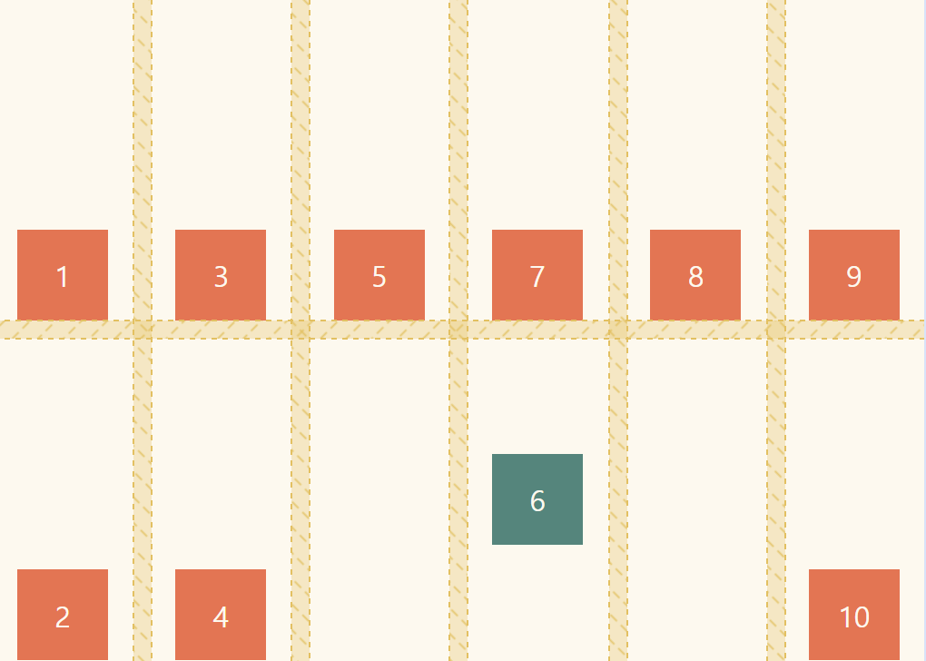
.child:nth-child(6) {
    background-color: teal;

    align-self: center;
    justify-self: end;
}
📌 place-self: align-self(세로) justify-self(가로);
- 단축 속성: align-self + justify-self;
- grid-column: span 3를 적용해서 6번 박스가 3칸을 차지함
.child:nth-child(6) {
    background-color: teal;
    place-self: center;
    /* value가 동일하면 하나만 써도 됨 */

    grid-column: span 3;
}

✨ 자식 요소의 크기는 column으로 지정하는게 아님!
- width와 height가 있을 때는 그리드 셀 내에서 박스가 움직일 수 있음
출처
노마드코더 CSS Layout 마스터클래스