📌 flex
- 직속 부모 요소에 설정 👉 flex container로 바꿔줌
(자식 요소에 설정 X) - 자식 요소도 flex container가 될 수 있음 (내부 글자 이동)
display: flex;
- 요소 가로 배치
- inline 요소로 변경됨 (크기가 자기 컨텐츠만큼만 설정)
📍 gap
: 요소 간 간격 조정
- 직속 부모 요소에 설정
row-gap
: 요소가 여러 줄 일때, 행(가로) 간격
column-gap
: 열(세로) 간격
📌 flex-direction
: 요소들이 움직이는 방향
- row: 가로 배치
- 기본값 (굳이 적지 않아도 됨) - row-reverse: 가로 + 주축 (오른쪽 👉 왼쪽)

- column: 세로 배치
- column-reverse: 세로 + 주축 (아래 👉 위)
📌 Main and Cross Axis
Axis: 축
- 축의 위치는 flex container의 direction(flex-direction)에 따라 달라짐
- 축의 범위는 해당 요소 내부임
- 축을 기준으로 요소를 이동시킬 수 있음
Main Axis: 요소의 주축
- 기본적으로 수평선 (왼 👉 오)
- flex-direction: row;(가로)가 기본값이기 때문
Cross Axis: 교차축
- 기본적으로 수직선 (위 👉 아래)
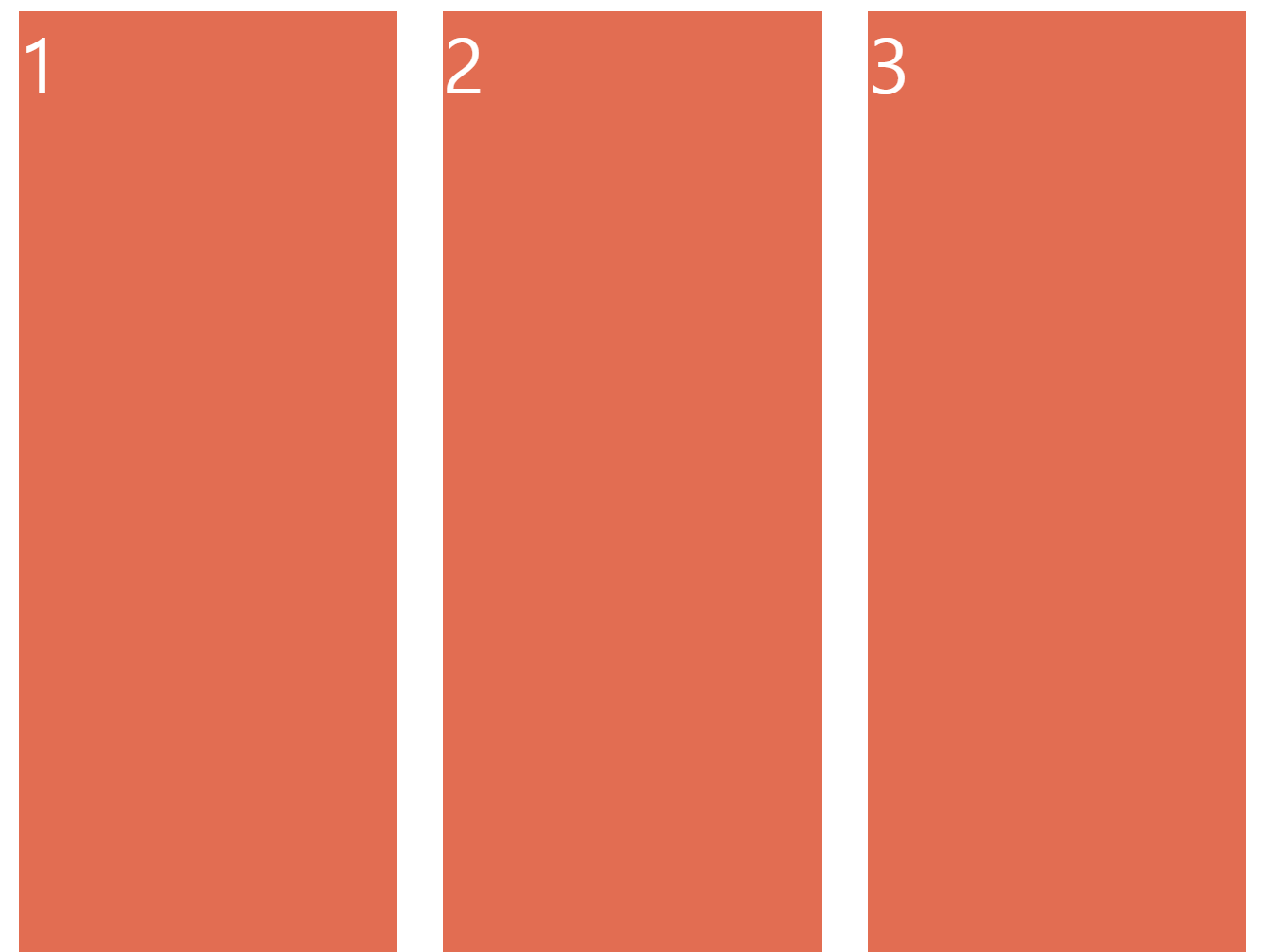
flex-direction: row;
- Main Axis = 왼쪽 👉 오른쪽으로 수평
- Cross Axis = 위 👉 아래로 수직
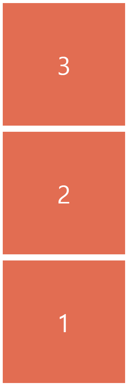
flex-direction: column;
- Main Axis = 위 👉 아래로 수직
- Cross Axis = 왼쪽 👉 오른쪽으로 수평
📌 주축에서 이동시키기
justify-content
: 요소를 주축에서 이동시킴
- flex-direction: row;
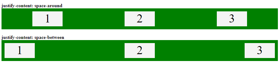
=> flex container의 Main Axis(가로선)를 따라 아이템을 정렬한다. - center: 가운데 정렬
- space-around: 상자 간 + 양 옆에 일정한 간격을 줌
- space-between: 상자 간에 일정한 간격을 줌
✨ justify-content: center 대신 사용할 수 있는 방법
부모 요소에 display: flex;
자식 요소에 display: flex; + margin: 0 auto;
See the Pen Untitled by nadia kwon (@nadia-kwon) on CodePen.
✨ space-evenly 대신 사용할 수 있는 방법
space-evenly / gap은 지원하지 않는 브라우저도 있음 👉 사용 지양
1. justify-content: space-between; (부모 요소)
2. padding: 0 30px; (부모 요소)
📌 교차축에서 이동시키기
align-items
: 요소를 교차축에서 이동시킴
- 부모 <div container>와 자식 <div>의 높이(height)가 같으면 효과가 미미하다.
=> 부모 <div>를 더 크게 만들어야 한다. (ex. height: 100vh;)
- align-items: stretch; : 자식 <div>에 높이(height)가 없을 경우, <div>의 높이(height)를 교차축의 끝까지 늘림
참고
How to set space between the flexbox ? - GeeksforGeeks
A Computer Science portal for geeks. It contains well written, well thought and well explained computer science and programming articles, quizzes and practice/competitive programming/company interview Questions.
www.geeksforgeeks.org
이번에야말로 CSS Flex를 익혀보자
studiomeal.com
출처
노마드코더 CSS Layout 마스터클래스